Using Graphs
•In this guide, we will use graphs to illustrate the number of people who may experience a benefit or side effect.
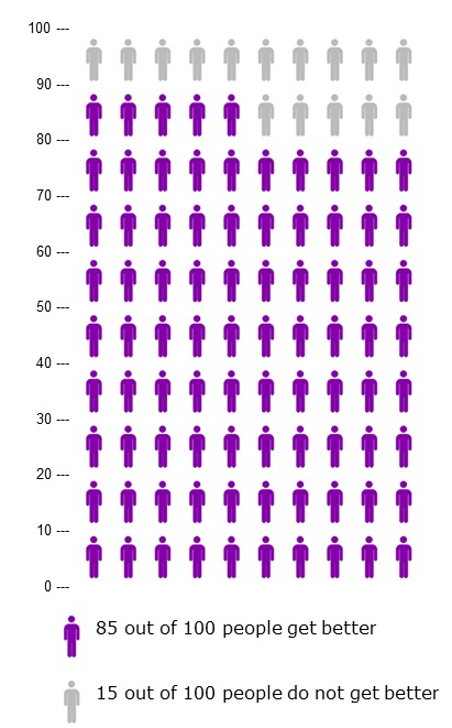
•For example, the graph to the right shows the number of people who DO (in purple) and who DO NOT (in gray) get better.
•In this made up example:
–85 out of 100 people get better, and
–15 out of 100 people do not get better.
