Using Graphs

- In this guide, we will use graphs to illustrate the number of people who may experience a benefit or side effect.
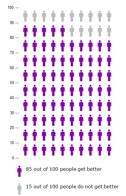
- For example, the graph to the right shows the number of women who DO (in purple) and who DO NOT (in gray) get better.
- In this made up example: